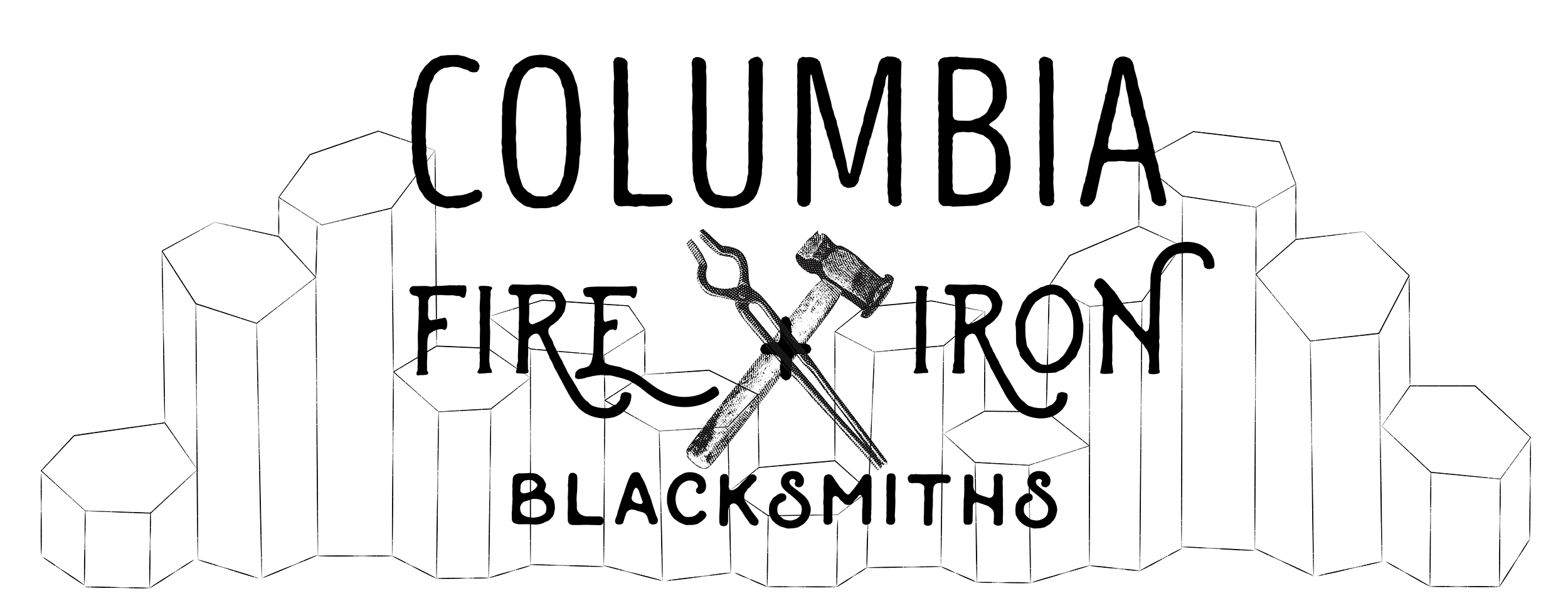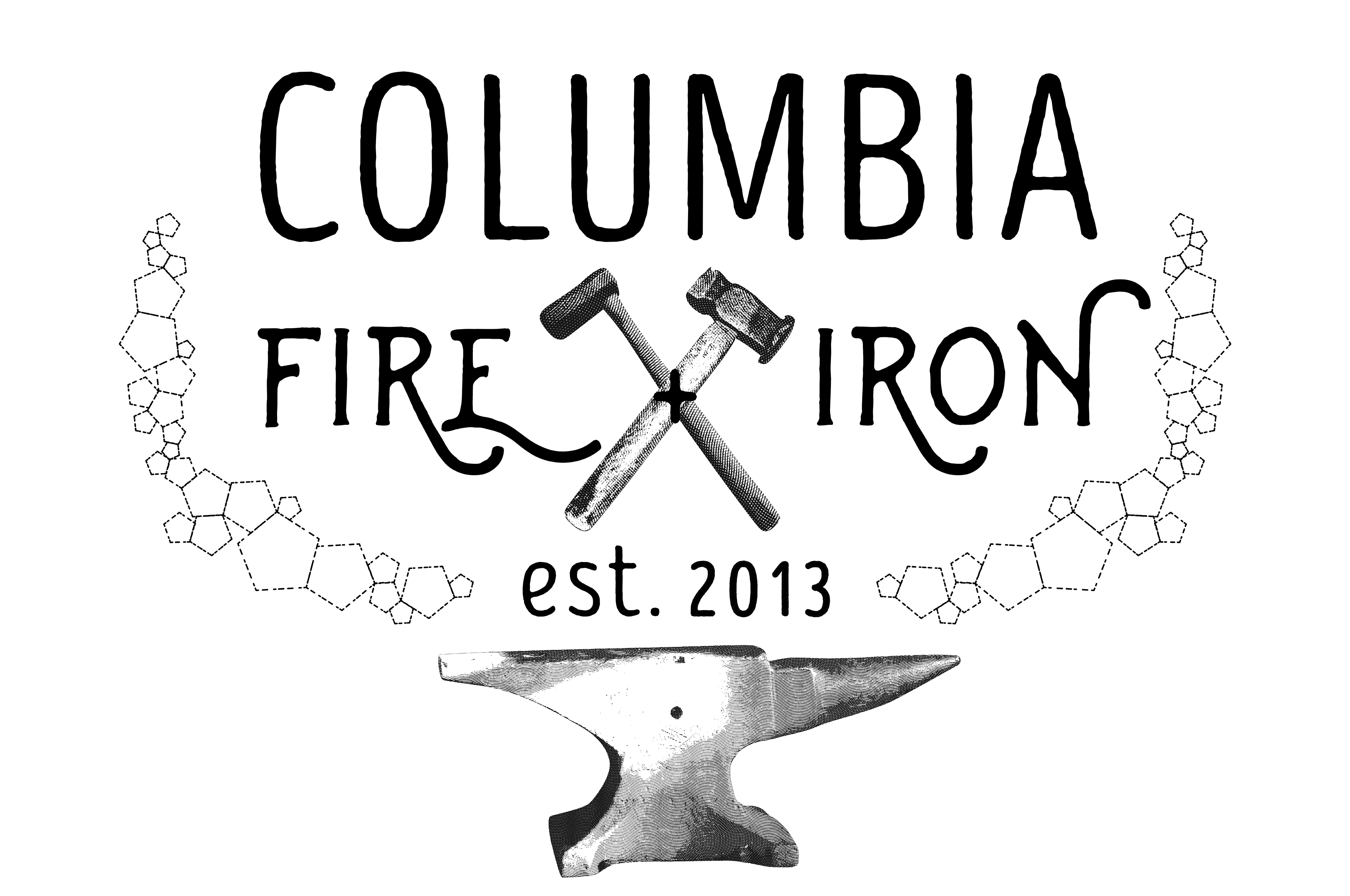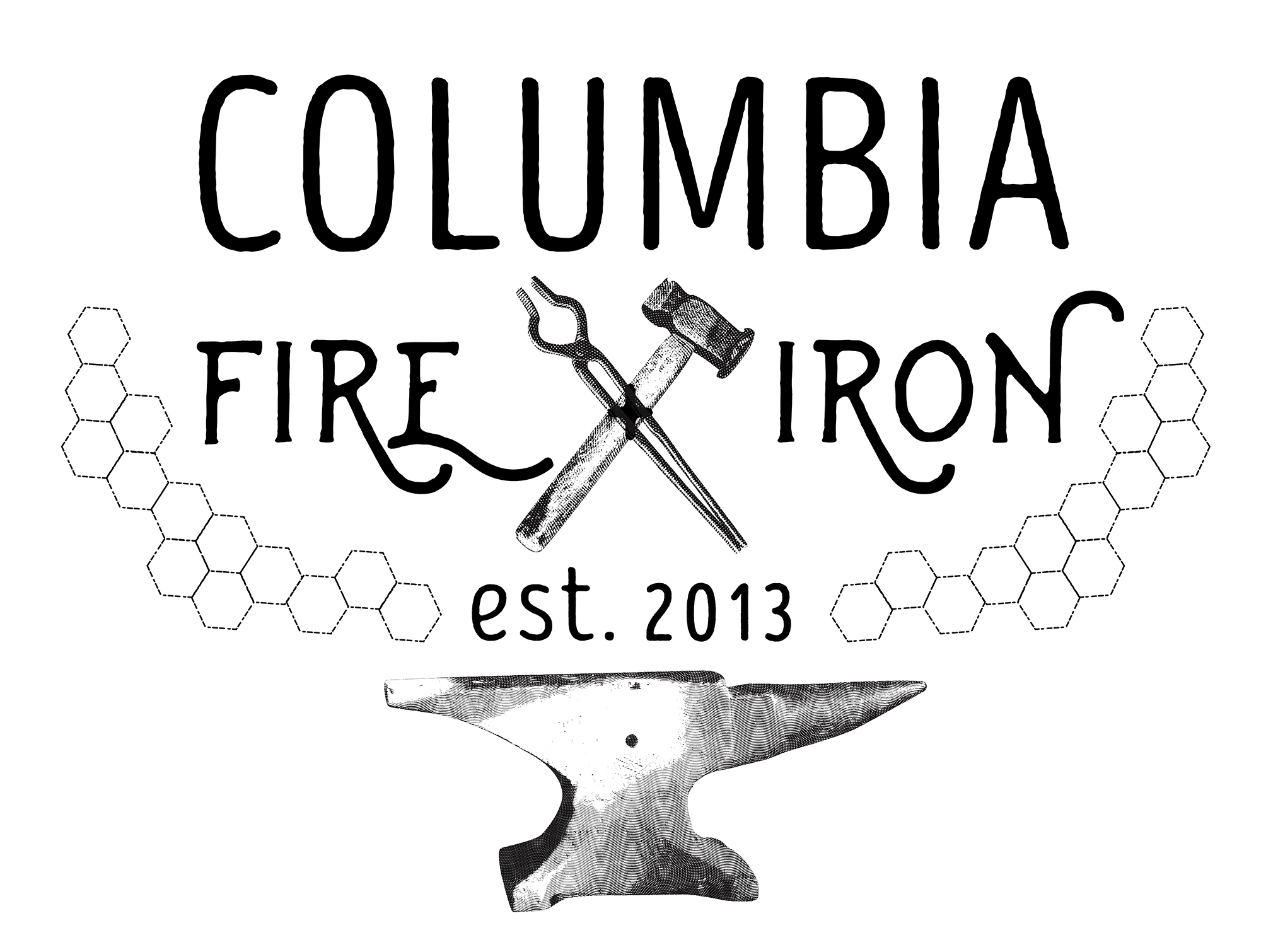
It’s always a fun challenge to create a logo for a committee, trying to fulfill everyone’s requirements. This logo went through several versions though the style remained the same. I liked the idea of employing an engraving look for the blacksmithing tools, because it has an old-fashioned yet timeless quality. The group wanted to keep the imagery of basalt columns, which had been part of the original logo, and much of the revising stemmed from making the basalt columns accurate and work well with the composition. I still like my first design for the composition, but my loose interpretation of the basalt columns was embarrassingly inaccurate. Meant to be a view from the top down, I had made them with too few sides (5 instead of 6) and had made them varying sizes. It was a good lesson in geology (science was never my strong suit). The basalt columns also connect at the sides and not the corners. A later version that corrected these issues was turned down for still being too abstract, so the final version (above) was adopted. For posterity, my favorite rejected versions are below.


Posted by Mallory on June 9, 2017